Create maximum-impact lawn signs by combining bold, thick fonts with high-contrast color pairings like black on yellow or white on red. You’ll want to size your main message at 4-6 inches tall, centered in the upper two-thirds of the sign. Place signs strategically in high-traffic areas, angled for ideal visibility from both vehicles and foot traffic. Choose durable materials like corrugated plastic or aluminum based on your timeframe. Master these core elements to transform your lawn signs from basic to attention-commanding.
Essential Design Elements for High-Visibility Lawn Signs
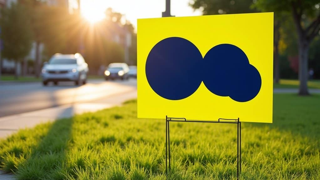
When designing a lawn sign that demands attention, the fundamental visual elements must work together to create maximum impact. Start with high-visibility color combinations, such as black text on yellow backgrounds or white lettering on red surfaces, to guarantee your yard signs stand out even in challenging lighting conditions.
Choose bold, thick fonts and size them generously while keeping the layout centered. You’ll want to avoid fancy typefaces that might look attractive up close but become illegible from a distance. If you’re including an image, select one striking visual that complements your message rather than competing with it. Consider the viewing angle and placement of your sign – what looks good at eye level might not work for drivers passing by. Position your design elements to optimize readability from different approach angles and distances.
Strategic Color Selection and Contrast Techniques
Selecting the right color combinations can make or break your lawn sign’s effectiveness. When designing yard signs, you’ll want to prioritize high-contrast color combinations that guarantee maximum visibility from a distance. Black text on yellow backgrounds or white lettering on red surfaces will make your message pop and remain readable even in challenging lighting conditions.
Consider your sign’s surroundings when choosing colors to make your message stand out. If your yard has lots of greenery, opt for contrasting shades like bright orange or bold purple. You’ll also want to incorporate colors that align with your brand or campaign identity while evoking the right emotional response. For political campaigns, traditional red, white, and blue combinations signal patriotism, while environmental causes might benefit from earth tones paired with vibrant accent colors.
Typography and Text Layout Best Practices

Your yard sign’s typography needs to follow a clear hierarchy, with your main message at 4-6 inches tall and supporting text at 2-3 inches for maximum readability at 30+ feet. You’ll want to maintain generous letter spacing and line breaks between text elements to prevent visual clutter and guarantee each component stands out distinctly. Position your primary message in the upper two-thirds of the sign while keeping your contact info or call-to-action in the bottom third, creating a natural flow that guides viewers’ eyes through your content.
Font Size Hierarchy Rules
To optimize a lawn sign’s impact, proper font size hierarchy guides viewers’ eyes through your message in order of importance. Choose fonts that are easy to distinguish and read from a distance, arranging text sizes to create visual flow.
| Text Element | Size Range | Viewing Distance |
|---|---|---|
| Main Message | 4-6 inches | 100+ feet |
| Secondary Info | 2-3 inches | 50-75 feet |
| Details/Contact | 1-1.5 inches | 25-50 feet |
Make your primary message 2-3 times larger than secondary text. Keep contact information proportionally smaller but still simple to read. This creates natural eye movement from the largest, most crucial elements to supporting details. Maintain consistent size ratios between text levels to guarantee professional appearance and maximum visibility for drivers and pedestrians.
Spacing For Maximum Impact
Effective spacing stands out as a critical element in lawn sign typography, making the difference between a message that pops and one that gets lost in the visual noise.
When designing yard signs for maximum visibility, center your text layout to harness the power of negative space. You’ll want to maintain balanced spacing between lines, keeping your message to 3-4 lines maximum. This approach guarantees your signs remain readable even in high-traffic areas where viewers only have seconds to process information.
Adjust your line spacing based on your sign’s dimensions, making sure there’s enough breathing room between text elements. For ideal impact, pair your spacing strategy with high-contrast color combinations and bold, large fonts. Remember to test your layout at various distances – proper spacing should maintain readability whether viewers are walking or driving by.
Strategic Text Placement Tips
Strategic text placement can make or break your lawn sign’s effectiveness, especially when drivers have mere seconds to grasp your message. When you place your signs, consider how text positioning impacts visibility and readability from various angles and distances.
- Center your message for ideal impact, using the middle of the yard sign to naturally draw attention and create a high-quality image that’s instantly recognizable
- Select bold, thick fonts that are easily readable from passing vehicles, avoiding decorative typefaces that could blur your message
- Implement high-contrast color combinations like black on yellow or white on red to guarantee your text stands out against any background
- Position text at driver eye level, considering the surrounding environment’s colors and potential distractions to enhance your sign’s effectiveness while maintaining safety
Optimal Placement Strategies for Maximum Exposure

When planning your lawn sign campaign, proper placement makes the difference between signs that get noticed and those that fade into the background. Position your yard signs in high-traffic locations where they’ll catch the most eyes – busy intersections, shopping centers, and main roads are prime spots for maximum visibility.
Keep your signs unobstructed by placing them away from trees and buildings. Angle them strategically so drivers and pedestrians can easily read your message. For the best impact, consider multiple sign placements throughout your target area to reinforce your message through repetition.
Before installing your signs, check local regulations and secure necessary permits. The right height and positioning will optimize readability, while strategic positioning in multiple locations guarantees your message reaches your intended audience effectively.
Material Selection and Durability Considerations
Your yard sign’s lifespan depends heavily on choosing the right material, with corrugated plastic offering excellent weather resistance for campaigns, aluminum providing years of outdoor durability, and foam core delivering pristine results for indoor use. You’ll want to match the material to your specific needs – consider elements like sun exposure, wind conditions, and seasonal weather patterns when making your selection. For long-term outdoor installations, aluminum signs withstand rigorous weather testing and maintain their professional appearance, while corrugated plastic proves ideal for seasonal displays, and foam core excels in controlled indoor environments.
Weatherproof Material Options
Selecting the right weatherproof material for your lawn sign can mean the difference between a lasting impression and a soggy disaster. Your choice will determine how well your sign stands up to rain, wind, and sun exposure.
- Corrugated plastic (Coroplast) offers excellent water resistance and durability while keeping costs down, perfect for temporary outdoor campaigns
- Aluminum yard signs provide superior longevity and professional appearance, making them ideal for conducive outdoor displays
- Foam core works best when you need high-quality printing, but keep these in a dry place or use them for indoor settings only
- Consider how long you’ll need your sign to last – temporary event signs might work fine with Coroplast, while business signs benefit from aluminum’s permanence
Choose materials that match your specific outdoor exposure needs and display duration for suitable results.
Durability Testing Standards
To guarantee your lawn sign withstands the elements, rigorous durability testing helps determine the best material for your specific needs. Testing your yard signs before installation confirms satisfactory performance in various weather conditions.
For outdoor displays, test corrugated plastic signs by exposing them to water spray and examining their structural integrity. Ensure that your sign maintains its shape and color vibrancy after exposure to direct sunlight. When using aluminum signs, verify their resistance to rust and corrosion by conducting salt spray tests. For foam core signs intended for indoor use, check their stability in controlled environments.
Test the mounting hardware’s strength by simulating wind conditions, and examine print adhesion by performing scratch tests. Document any material degradation, color fading, or structural weakening to make informed decisions about your sign’s placement and expected lifespan.
Lifespan By Material Type
Different yard sign materials offer distinct advantages in the matter of longevity and durability. To make your signage investment worthwhile, you’ll need to match the material to your intended use and timeframe.
- Corrugated plastic (Coroplast) signs can serve you well for up to 2 years outdoors – make sure to clean them occasionally with cloth and mild soap to guarantee visibility
- Foam core signs work best for indoor displays, offering crisp print quality and easy handling when you need temporary solutions
- Aluminum signs deliver professional-grade durability for long-term outdoor exposure, making them ideal for permanent business signage
- Material selection directly impacts your sign’s weather resistance and visual appeal – choose based on your specific display duration needs
Always consider your environment and display duration when selecting materials to achieve optimal performance and longevity.
Measuring and Improving Sign Performance
Success in lawn sign marketing requires systematic measurement and continuous optimization. To guarantee your signs remain a powerful tool, you’ll need to track customer inquiries and conversions directly linked to your campaigns. This data helps calculate your real estate marketing ROI and guides future improvements.
Monitor foot traffic patterns where your signs are placed and gather community feedback through targeted surveys. Compare different designs to identify which call to action and visual elements generate the strongest response. Pay attention to factors like color schemes, text size, and messaging clarity.
Create a performance tracking system that measures key metrics consistently. Use these insights to refine your sign placement strategy, update designs, and boost overall visibility. Regular assessment helps you identify what’s working and allows for quick adjustments to elevate impact.
Frequently Asked Questions
How to Design an Effective Yard Sign?
To design an effective yard sign, you’ll want to start with eye-catching graphics using bold, high-contrast colors that pop from a distance. Keep your targeted messaging brief and punchy – think headlines, not paragraphs. Use large, readable fonts and maintain plenty of white space. Vital placement is crucial, so position your sign where it catches natural sight lines. Remember to test your design’s visibility from different angles and distances before finalizing.
Is It Legal to Put Yard Signs on Public Property?
Generally, you can’t legally place yard signs on public property. Most local laws and municipal regulations explicitly prohibit placing signs in public spaces like parks, medians, or along roadways. You’ll need to stick to private property with the owner’s permission. If you ignore these rules, you’re risking fines and your signs will likely be removed. Always check your specific city or county regulations before placing any signs.
What Is the Best Material for a Yard Sign?
For most outdoor yard signs, you’ll find corrugated plastic (Coroplast) is your best choice. It’s durable yet lightweight, making it easy to transport and install. You’ll appreciate its weather-resistant construction that stands up to rain, wind, and sun without warping or fading. It’s also one of the most cost-effective material options available. If you’re planning for long-term use, consider aluminum signs, though they’re pricier. For indoor displays, foam core offers excellent print quality.
How Profitable Is a Yard Sign Business?
You’ll find yard sign businesses can be highly profitable with typical margins of 30-50% per sign. Your cost per sign might range from $5-15, while you can charge $25-50+ depending on design complexity. Start-up costs are manageable, often under $2,000 for basic equipment. You’ll amplify profits by targeting election seasons, real estate agents, and local businesses. With smart advertising strategies and minimal overhead, you can break even within a few months of consistent operation.
